How to bring out colors: A tutorial
A tribute, an example image and a problematic treatment
Just recently, Dan Margulis was honored the 2023 Progress Award of the Photographic Society of America (PSA) for his authoritative work in the field of digital color correction of photographs. See https://psa-photo.org/page/progress-awards for a full list of recipients of this award. Needless to say, I consider this recognition well-deserved. As I have often stated, all of my website is highly inspired by his work.
The article you just started reading may be seen as a tribute to Dan’s work as it brings together a few of its central themes. I will present a technique that first and foremost helps to enhance color in photographs in an effective and natural way. As such, it can be seen as just another tutorial – but there is more. The technique touches Dan’s Picture Postcard Workflow as I believe it can serve as an alternative for one of the steps of that workflow (more on that later). It also relates to Eugène Chevreul’s law of simultaneous contrast of colors, a theory that has been extensively studied by Dan. And last but not least, the main work of the tutorial takes place in the LAB color space – need I say more?
Figure 1 below is an image taken in the Schwarzwald Museum in the village Triberg in the southwest of Germany. It is a nice collection of the traditional Black Forest “shield clocks”, a category to which the more familiar cuckoo clock belongs, a specialty of the region. (Some of the clocks on the right are cuckoo clocks.)
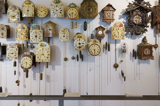
Figure 1. An original image taken in a museum
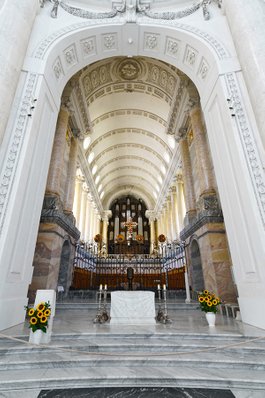
Cathedral, Sankt-Blasien
The image version as shown is pretty much the result of default camera raw processing, having only undergone some cropping and a slight lightening. For the current discussion, we look at its colors only (in fact, we restrict ourselves to color saturation). The colors of this photo are, as I assume you would agree, dull. The yellow and brown clock faces with their decorative paintings could definitely use quite a bit more. So I loaded the image in Photoshop, added a Hue/Saturation adjustment layer and moved the Saturation slider to +30. The result is shown in figure 2.

Figure 2. Result after applying a quick saturation boost
Successful? Not quite. The clock faces have certainly improved, but the saturation boost has not been beneficial for the wall behind them. I presume that this wall was in reality plain white. In the original photograph of figure 1, the wall already contained a variety of colors, from reddish in the lit areas to bluish in the shadows. This is not uncommon for photographs taken in mixed lighting situations, and usually no big deal because the colors are very subdued. But intensifying these false colors is a bad idea. The colors of the background wall in figure 2 have gotten very noticeable, and I think this degrades the whole image. The saturation adjustment has caused an unappealing appearance: we need a different treatment.
It's not difficult to formulate what we want then. Colorful elements of the original must be made more brilliant. Less colorful elements must be held back, or even sacrifice some of their color. The result will hopefully look more pleasing and natural than what a dumb saturation increase produced. In addition, I believe that the boosted colors stand out even more if the surrounding areas are closer to neutral – this is the link with Chevreul’s law of simultaneous contrast. Below follows a tutorial to accomplish exactly that.
Tutorial part 1: Selectively desaturating
Start with any (layered or not) image in Photoshop. Our procedure will run in the LAB color space, so I suggest to invoke a smart object. If you don’t want that, skip steps 1-4 and convert your image to LAB color right away.
1. Create a new layer on top of the layer stack and press Ctrl-Shift-Alt-E to merge the full image into the new layer.
2. Rename the new layer to “Bring out colors” (or any name you like).
3. Right-click the new layer and click Convert to Smart Object.
4. Double-click the layer icon to open the smart object.
5. Menu: Image – Mode – Lab Color to convert the image to the LAB color space.
The actual appearance of the image has not changed yet. It’s time to start the real work. Continue as follows.
6. Add a Hue/Saturation adjustment layer and rename it to “Selectively desaturate”.
7. In the Hue/Saturation Properties popup, move the Saturation slider fully left (-100). The image turns black-white, this is on purpose.
8. Double-click the layer to open the Layer Style popup.
We now need to restrict the desaturation action to the “less colorful” pixels. Question is how to define “less colorful”. In terms of the Layer Style, we have to find the proper positions of the blend-if controls for the two color channels (A and B). This depends on image characteristics and personal taste, both of which I have no idea of, but the general instructions that follow should work for most situations.
9. First, set the Blend If drop-down to “a”. This manages the green/magenta range of colors.
10. If the image contains greens that we want to stand out, pick the leftmost (black) control under the bar that is called Underlying Layer and slide it to the right. Keep moving until the important greens become visible. If there are unimportant greens (closer to neutral), make sure they remain gray. Do not pass the middle of the bar.
11. Split the control by click-and-holding the Alt button and dragging the left half of it slightly to the left, and the right half slightly to the right. This step forces gradual transitions between affected and unaffected pixels, and thus prevents hard edges in the resulting image. (See figure 3 which also shows small green patches that have become visible on the clock faces.)
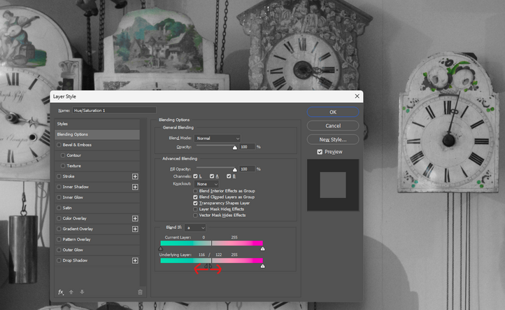
Figure 3. The mechanics of the Blend If control for the current image
12. Repeat steps 10 and 11 for the rightmost control under the same bar (the one on the magenta side) to separate important magentas from unimportant ones.
Figure 4 shows the possible layout of the Blending Options for the A channel. Figure 5 shows the intermediate look of our example image.
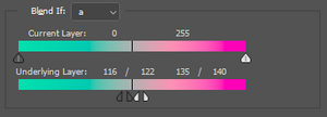
Figure 4. Possible Blend If settings for the A channel
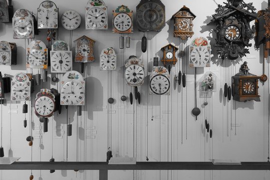
Figure 5. Image appearance after applying the settings of figure 4.
The important notion is that the background wall is still gray. Not much of the clocks has retrieved its color yet, but that will change shortly as most of them have yellow tones.
13. Repeat steps 9-12 for the B channel. The Blend If drop-down must be set to “b”. Important blues and yellows will be recovered.
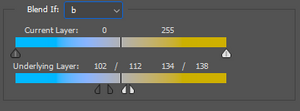
Figure 6. Possible Blend If settings for the B channel

Figure 7. Image after finishing the "selectively desaturating" steps
Figure 6 shows the Blending Options settings for the B, and figure 7 the resulting image version. Note that the clock faces now have their color back, while the background wall is still close to neutral.
Tutorial part 2: Resaturating
We have just finished the most difficult part of the tutorial. The remaining steps are straightforward. Continue as follows:
14. Reduce layer opacity to 60% (or any percentage that you think is appropriate). This brings back some of the color in the desaturated areas. Keeping them absolutely neutral would give a very unnatural look.
15. Add a second Hue/Saturation adjustment layer. Change its name to “Resaturate”.
16. In the Hue/Saturation Properties popup, increase Saturation to taste. A reasonable value could be +30, but this really depends on the nature of the image.
17. If you like, you can adjust individual colors separately from each other. In this way blues could be accentuated more than reds, etc.
18. Save and close the smart object. (Or if you didn't create one, flatten your image and convert back to RGB.)

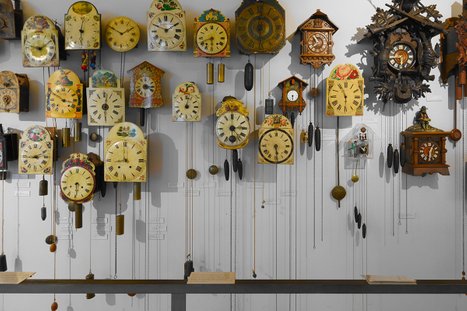
Figure 8. Left: original. Right: final version after applying the tutorial of this article.
Figure 8 shows the original image (left) juxtaposed with the final version (right). As envisioned, the clocks have gotten more color while the wall has lost most of it. This idea is so simple and at the same time so effective that presumably many more people must have devised some action to accomplish a similar effect. Yet, I can’t remember ever having seen anything like it, so here is my small contribution to the Photoshop world.
The remainder of this article is filled with remarks and tips that may help you using this tutorial.
When to invoke it
First, let me say some words about how often and for which type of image this technique may be effective. How often is hard to say, probably it’s only a small minority of all possible photographs. My guess is that it’s not very useful for landscapes and portraits, maybe occasionally for a special artistic effect. For architecture and interior photography however, a beneficial effect may be much more common. See the above example. Also church interiors come to mind: colored objects like gold decoration will be accentuated while background walls retain their neutrality.
The general criteria is this: if your image contains “more colored” areas that you want to be emphasized, while the remainder of the image is “more neutral” and should preferably stay dull, then invoking the action may be worthwhile.
Second, you may note that the “selectively desaturate” part of the tutorial resembles the H-K action of the Picture Postcard Workflow (PPW) panel. (For those not familiar with that, see this article which contains an extensive analysis.) Of course I did a comparison with H-K. See figure 9 below which puts the result of my tutorial (left) next to what a call of the H-K action plus a saturation boost produced (right). The conclusion is that H-K is not very effective in holding back less saturated colors.
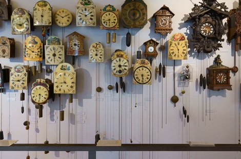
Figure 9. Left: final version from the new tutorial (left). Right: H-K plus saturation boost applied.
I think it follows that the “selectively desaturate” procedure may deserve a place in the PPW, as a more pronounced alternative for the H-K action (but without the darkening part). For those who own the Modern Photoshop Color Workflow book, read the beginning of the paragraph titled “Much Faster Than Possible” in chapter 13 for a musical analogy of what’s being accomplished. Create an illusion of colors “more intense than possible” by desaturating less interesting and less colorful image areas.
The automation part
For a long time, I hesitated to make a downloadable Photoshop action available containing the steps of the tutorial. The issue could be that the position of the controls in steps 10-13 cannot be fixed and depends on the color distribution of the image being processed. But eventually I concluded that such an action may still be helpful for many, including myself. Just be aware that the result of the action must not be taken for granted!
So I finish my article with a few tips, explaining what to do when the action gives an undesired or suboptimal result. We assume that the image is divided in “more colorful” parts that need to be brought out, and “less colorful” parts that need to recede. The action chooses some defaults that may be good enough in many cases, but disappointing in other cases. If the latter, often the problem is easy to fix. If the “more colorful” image parts do not have the optimal color intensity (not enough, or too much), open the smart object and adjust the Saturation slider of the Resaturate layer. If the “less colorful” image parts are not to your liking, open the smart object and adjust opacity of the Selectively Desaturate layer.
But other situations are harder to solve. The following paragraphs show an example, plus instructions how to deal with it.
An advanced example
The photograph of figure 10 was taken in another museum, not far from Triberg but at the other side of the Rhine. The city is Colmar in France, the museum called Unterlinden.
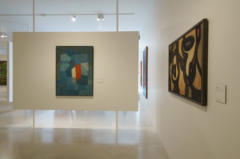
Figure 10. Original image
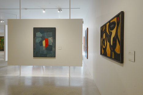
Figure 11. Result of applying the automatic action
The color characteristics of the image are similar to what we saw in figure 1. Walls, ceiling and panel are supposed to be white, but in the photograph they are yellowish where illuminated by artificial light and bluish where outdoor lighting is dominant. The paintings are obviously the most important objects and can use more brilliant colors. So we run our new action. Figure 11 is the result.
Let’s compare the two versions. The desaturation layer has done its work as the white elements have definitely lost some of their “false” coloring. But the desaturation touched most of the painting left of the middle as well. Only the yellow and red patches have gotten stronger, the rest of the painting has lost color, clearly an unwanted effect.
How come? Well, the short answer is that the distinction between “less colorful” and “more colorful” as made by the action is not the right choice for this particular image.
For a more precise answer, let’s open the smart object. “Selectively desaturate” is the layer to look into. Remember that this layer does a 100% desaturation (later reduced to 60% opacity), but it limits this adjustment according to some Blend If settings. Ideally, the values should be such that the blue tint on the ceiling is included (i.e. desaturated) but the blue on the painting is not. Is that possible?
That question has a surprising answer. We open the Info panel and have a look at LAB’s color channel values. On the ceiling above the big panel, it’s approximately A -4 and B -8. That’s a blue with a greenish tint. On the painting we have a multitude of blue patches, but they all seem to share a common property: they have a stronger A than B. Typical values are A -10 and B -6. In other words: they are more green than blue. You probably won’t see that in the image itself, but I suspect it’s caused by the yellow light that hits the panel. Anyway, to properly distinguish the two, our target must be the negative A’s – not the negative B’s.
The solution
Double-click on the Blend If symbol on the layer. The green side of the A shows 104 / 116 as limiting values. Given that the A is measured as positive or negative values around the middle (128), this translates to limits of -24 and -12 of the A channel. Here is what that means:
- Any A value lower than -24 is fully excluded from the desaturation adjustment; these are the strong greens
- Any A value between -12 and 0 is fully included in the adjustment; these are the close-to-neutral greens
- Any A value between -24 and -12 is partially included; the closer to -24, the less effect the adjustment will have
What we want is the distinction to be set between -4 and -8, so that the painting colors will be recovered but the ceiling is kept desaturated. Mapped to the math of the Blend If panel, we set the leftmost controls to 120 and 124 respectively (see figure 12).
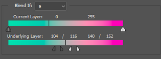
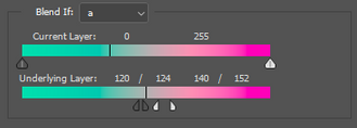
Figure 12. Blend If settings for this image. Left: action default. Right: corrected.
The effect is precisely what we want. See figure 13 for original (left), default action result (middle) and corrected result (right) for a close-up of the painting.
Figure 13. Image fragment. Left: original. Middle: as produced by the action. Right: corrected as described in the text.
Note how the blue of the ceiling and the yellow of the panel have been reduced by the action (middle version). Note also how the blue-greens of the painting have become much brighter in the right (final) version, while retaining the duller background.
This finishes my tutorial. For those willing to download my new action plus a concise manual, it can be found here.
Gerald Bakker, 3 Oct. 2023
Tutorials and Actions