Picture Postcard Workflow: Analyzing the Lesser Hammer action
A different hammer
Some months ago I wrote an article that unravels the Bigger Hammer action. Writing that article was a breeze: the Bigger Hammer action is straightforward and easy to explain, although it may not always be easy to use because of its side-effects.
The Lesser Hammer is definitely more difficult. Not the layer structure: that is remarkably similar to its big brother. The part that makes Lesser Hammer more difficult to explain is the blurring method of the Overlay layer.
Before I dive in, let me recap the basic layer structure. From bottom to top, the following layers are created by the Lesser Hammer action:
- A layer called Overlay that is light where the image is dark, and vice versa; in Overlay blend mode, this darkens light areas and lightens dark areas, thus enhancing detail in highlights and shadows. A clever way of blurring tries to retain local contrast while preventing halos.
- A Darkening layer that reduces the overlay effect in dark areas. Default opacity of this layer is 50% which seems to be a good compromise. Obviously this opacity can be adjusted to taste.
- A Restore Color layer that restores the original color, which can be severely damaged by the previous layers.
- A Lightening Curve layer that recovers some of the global contrast, as the image is usually flattened considerably.
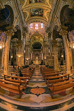
Church Interior
One doesn't need much imagination to see the similarities with the Bigger Hammer layer structure. The Overlay, Darkening and Restore Color are common. Bigger Hammer needs an Unblur to reduce the halos, Lesser Hammer adds a Lightening Curve that reduces the flattening effect. This gives us a clue about the main difference between the two. Bigger Hammer keeps excellent local contrast but is prone to halos, Lesser Hammer doesn't suffer halos so much but gives flatter results. The difference is caused by a different way of blurring.
Blurring? Well, yes. Let me first explain why we have to blur in this process.
Remember, the Overlay layer in Bigger Hammer is constructed by copying the Background layer (or any of its channels), invert, blur, desaturate and set to Overlay mode. Without the blur, this procedure would give a very flat result. All contrast would be diminished: dark areas get lighter, light areas get darker (that's good) but this happens on a micro-level too. Small contrast is destroyed. To prevent this, we have to blur: this recovers local contrast.
However... a simple gaussian blur has a nasty side effect of causing halos. This happens in the Bigger Hammer action. To prevent such halos we have to blur differently. The Lesser and Velvet Hammers aim at exactly that.

Figure 1. Original image
The story of a blur
So let's see how the blurring works for the Lesser Hammer. We follow an example image, see figure 1 for the original.
Contrary to the Bigger Hammer, the Lesser Hammer starts with a Smart Blur. Smart Blur is considerably different from Gaussian Blur, the deviation being that it tries to keep sharp edges, while blurring everything else. How sharp a "sharp edge" must be is determined by the filter's threshold parameter. See figure 2 and 3 for the effect of Smart Blur and Gaussian Blur respectively. Figure 4 shows fragments of both. The difference is, well, significant.
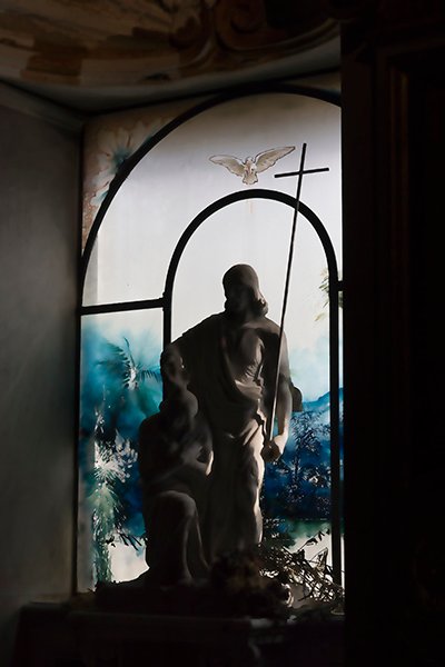
Figure 2. Smart Blur

Figure 3. Gaussian Blur
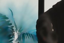

Figure 4. Fragments of both
So, starting from the Background layer, we copy and run Smart Blur, radius 35, threshold 75. An interesting experiment could be, now that we have a blurred version that seems to avoid halos - what if we follow the rest of the procedure of Bigger Hammer? We invert, desaturate and overlay this layer.
Sure, why not. The result is figure 5. For comparison, I repeated the process but with Gaussian instead of Smart Blur (i.e. the basis for Bigger Hammer) and put the result next to it, see figure 6.

Figure 5. First result starting from Smart Blur
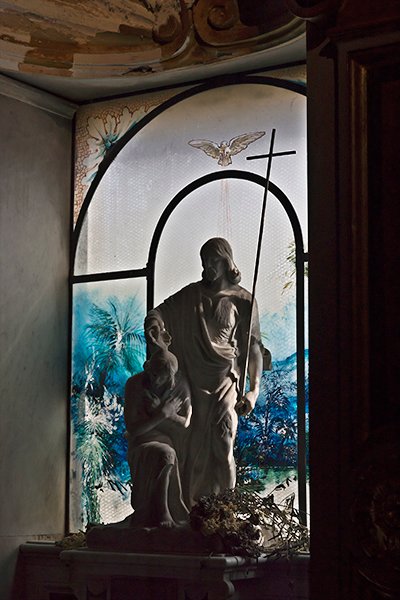
Figure 6. Idem starting from Gaussian Blur
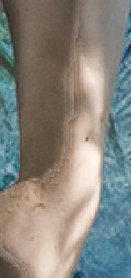
Figure 7. Artifacts
The difference is striking. The Gaussian Blur version does a much better job in retaining local contrast. Apparently the Smart Blur is not as good as we thought. Also, Smart Blur can introduce nasty artifacts. See figure 7 for what happens on the left arm of the statue. We clearly need some more blurring.
Lesser Hammer does this by cleverly mixing the Overlay layer that we just created with a more or less "normal" Gaussian Blur. It mixes - here comes the technical part - 50% dark halos of a 20-pixel blurred version and 65% light halos of a 40-pixel blurred version. Without going into much detail of this, all I can say is: dark halos will become light halos when we invert the layer. Light halos are more obtrusive than dark halos, so better keep them smaller (20 pixels) and less strong (50%). The light halos will become dark after inverting; we can afford a larger radius (40 pixels) and a stronger effect (65%). The actual figures are not so important but the idea should be clear.
Whatever, we follow this procedure and arrive at a layer that looks like figure 8. Invert, desaturate and overlay gives us figure 9. For comparison: figure 10 is the same as figure 5, the version before the Gaussian blur part.
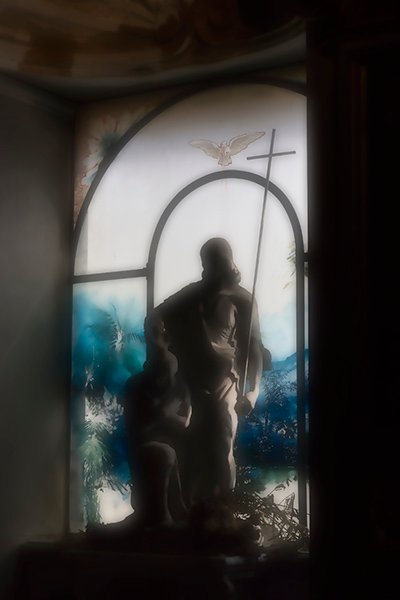
Figure 8. With extra blur applied
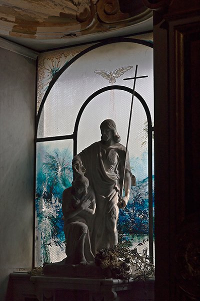
Figure 9. The result from figure 8's blurs
Figure 10. Same as fig.5
Figure 9 is definitely better than figure 10 in terms of local contrast. The whole extra blur step is some sort of a compromise: too much extra blur and visible halos would reappear, not enough and we are left with a flat result.
To color or not to color?
Hoping you are still with me, I have a surprise for you. The Overlay layer of Lesser Hammer doesn't desaturate. It leaves the colors in - for reasons that I am not really sure about. Note that an inverted not desaturated layer in Overlay mode neutralizes colors considerably. Later, the action adds a "Restore Color" layer, but limited to 70%. As a consequence, colors are always slightly toned down. This helps to increase detail in strongly colored image areas - something the panel documentation rightly emphasizes.
NB Bigger Hammer is quite the opposite. Its Overlay layer is a grayscale, and its Restore Color layer is optional. By default, BH *strengthens* colors, which helps to enhance very light areas.
This is basically it, the other layers are there to reduce the effects of the first layer.
The other layers
- Darkening. This is a copy of the Background layer, in Darker Color mode, at 50% opacity. It's there because in most cases, adding detail in highlights is more important than in shadows. Its function is exactly the same as in the Bigger Hammer layers.
- Restore Color. Again a copy of the Background layer, in Color mode, at 70% opacity. This is an important layer that in my opinion should never be switched off, unless the user knows very well what he is doing. See figure 11 for what happens in our example image when the Restore Color layer is switched off (everyting else as default). Note, this is just a small area of the image and could well remain unnoticed.
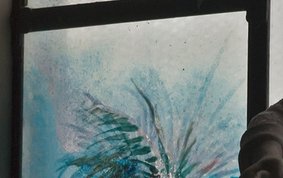
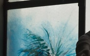
Figure 11. Decolorization effect. Right: same area from the original image.
- Lightening Curve. This layer was added to recover some of the contrast in the image. In the panel documentation, Margulis suggests to check the look of the image and if all right, switch off this layer. Global contrast can be adjusted at the final stages of the PPW.
The name "Lightening Curve" is slightly misleading. This layer lightens and increases contrast - two effects of which the contrast increase is the most pronounced.
See figure 12 for original and Lesser Hammer default juxtaposed.
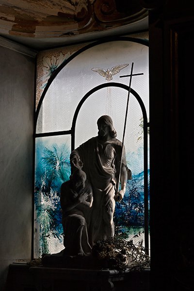
Figure 12. Original and Lesser Hammer default
Some variations
An interesting thought is the following. Imagine for some image we are not interested in enhancing dark areas, only light areas need better detail. We'd have to change opacity of the Darkening layer to 100% to get what we want. Yet, there is the Lightening Curve layer that tries to increase contrast in both light and dark areas. The net result is a darkening of the shadows, presumably undesired.
When that happens, and you want to keep the Lightening/Contrast correction for the highlights, proceed as follows:
- As indicated before, set opacity of the Darkening layer to 100%
- Make the Lightening Curve layer active and click on its mask
- Menu: Image - Apply Image
- Enter Layer: Merged; Channel: RGB; Blend: Normal; Opacity: 100%
- Hit OK
That's it. Dark areas protected from the recovered contrast. This time, there is no need to blur the layer mask.
For the opposite situation - better shadows desired but leave highlights unaffected, a very rare situation - do the following:
- Rename the Darkening layer to Lightening and change its blend mode to Lighter Color
- Change the opacity of the new Lightening layer to 100% (not to be confused with the Lightening Curve layer!)
- Now activate the Lightening Curve layer and click on its mask
- Menu: Image - Apply Image
- Enter Layer: Merged; Channel: RGB; Blend: Normal; Opacity: 100%
- This time, click the Invert button
- Hit OK
There you are. Nicely enhanced shadows, and no change in the highlights. See figure 13-15 for a comparison of original, final version with enhanced highlights only and final version with enhanced shadows only.
Gerald Bakker, 25 Feb. 2016
Figure 13. Original image
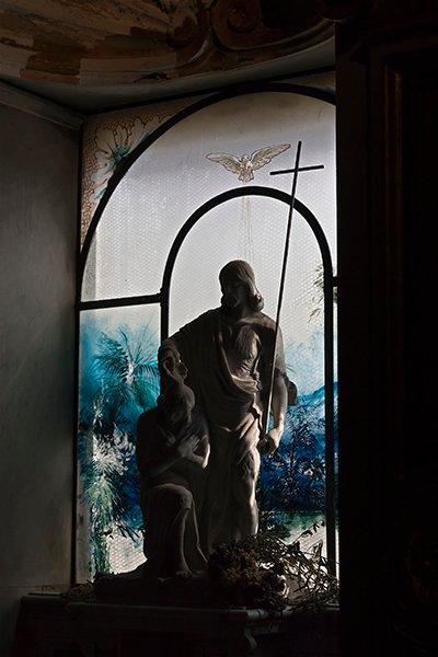
Figure 14. Only highlights enhanced
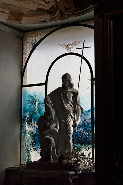
Figure 15. Only shadows enhanced
Picture Postcard Workflow