Picture Postcard Workflow: MMM Finetuned revisited
Some history
April this year I finished the development of an action that I called "MMM Finetuned". I found it interesting enough to announce on the Yahoo Applied Color Theory forum, the place where (roughly said) Dan Margulis' ideas are discussed. Busy as he was back then writing his Canyon Conundrum book (Photoshop LAB Color 2nd edition), Margulis posted his reaction on my announcement four months later, in August.
Again four months later, I'd like to respond to his reaction, and zoom in on the specialties of MMM Finetuned action, and on the differences with the original MMM action.
My first append is cited on this page: http://geraldbakker.nl/PPWF/MMM-how-to-use-it.html (scroll down to the bottom).
Here is Margulis' answer from August:
"I thought that the idea was significant enough to mention in the last chapter of the new Canyon Conundrum book, because it has a lot to do with the philosophy of color correction. The problem is a very old one. Suppose there is one important object in the foreground, such as a product or a person. We would like, as a general rule, to bring out contrast and color variation in that object. Doing so often results in a loss of detail or color accuracy in the background. Again as a general rule, this is not a bad thing. It makes the background more boring and sends the viewer’s attention to the main object.
In any case, traditionally doing it any other way would have been difficult. Just selecting out the background so that it wouldn’t be affected usually made it look like the foreground object had been cut out and pasted back into the picture.
Today, though, it is possible to increase contrast in *both* areas even in if they don’t share the same tonal range. Or, perhaps enhance it in more than two ranges. This is the theory behind what once was known as HDR. It is also the theory behind Gerald’s use of MMM in more than one place in the image, yielding more color variation as well as more contrast.
The question remains whether to do it. Of course, that depends on the image. Where it is truly one important object and a less important background, probably not unless the background is so boring that it would look better with slightly altered color. Or, when the background itself is somewhat iconic, such as when a model is standing in front of the Grand Canyon.
There is more to be said for the approach in landscape images, where we are supposed to take in the totality of the scene and not concentrate on a single part. Applying the action to too many parts, however, may result in a visually confusing image.
Anyhow, it’s a useful new tool that reminds us a lot of why we do things. Gerald’s explanation of how and why is at
http://geraldbakker.nl/PPWF/MMM-how-to-use-it.html
along with a lot of other material pertaining to the PPW generally. Good job!"
A Bell Factory
Of course I was delighted when I read this text. And not long before that, I had been even more delighted to see my small contribution - together with my name - mentioned in Margulis' new LAB Color book. All this gave me an incredible feeling of reward.
A first reaction
Margulis' reaction as cited above can be split in two parts. First is a historical/philosophical consideration, next a more practical view: in which cases should we apply this new action?
Myself, I had never considered my action from a philosophical viewpoint. My only motivation was a practical one. I explained that in the article that Margulis refers to. In case you haven't read that, here is a very short recap.
The MMM action tries to increase color variation, starting from a selection that is advisory only. Let's say one wishes to enhance greens; the selection would contain typical greens. The effect is that greens get more variation, in hue and in saturation. To make room, other hues move away from green, sometimes causing significant color moves. Neutrals however are protected through a mask.
The increased variation in the greens is wonderful, the shift in other colors can be questionable. To counter an unwanted color shift, two methods are available:
- Manually, use blend-if sliders. This is what Margulis suggests in the MPCW book
- Automatically, use the MMM Finetuned action
Although these two mechanisms are technically different, the underlying ideas behind them are in fact identical. One wishes to enhance certain colors and leave others alone. The blend-if method, being a manual action, takes more time but is more versatile. The automatic action is quick but may deviate from the envisioned result.
Both methods allow a retoucher to enhance variation in multiple image areas (e.g. greens and browns). In both methods, an artistic assessment must be made when to stop. Do we strive for an "HDR" effect, or do we prefer a more conservative look? That question is relevant, no matter if we use MMM or MMM Finetuned.
In this article, I will use an example image to show and explain the differences between MMM with blend-if and MMM Finetuned.
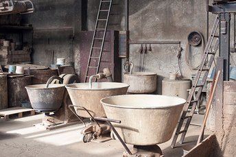
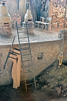
Figure 1. Original image
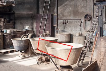
Figure 2. Advisory selection in red
See figure 1 for the original. It cries for an MMM treatment, given the many light brown shades with little variation. See figure 2 for a logical advisory selection, and figures 3 and 4 for the default results of MMM and MMM Finetuned respectively.
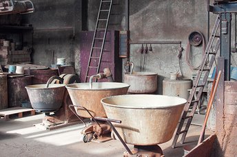
Figure 3. MMM applied with default settings

Figure 4. MMM Finetuned in default settings
Color
The main disadvantage of the original MMM action (and the main reason why I wanted MMM Finetuned) can be seen in the rusty background plate, just left from the middle of the photo. In the original, it has a more reddish brown than the selected color. In the MMM version, it has become purple. The MMM Finetuned version doesn't have that effect. To understand what happens here, let's have a close look at the LAB color values.
Look again at the advisory selection (figure 2). When we average the pixels of this area, the color values appear to be A=5/B=10. This is a pinkish yellow, or a highly desaturated orange. A color between yellow and red. Let's call this the "center color". Applying MMM will move all colors away from this center color. Yellow hues will move towards green and reds towards magenta, both away from the selected orange.
The rusty background plate in the image starts with a color of about AB 10,2. More magenta and less yellow than the center color. The MMM action makes A even higher and B even lower. More magenta and more blue. The result is a purple tint, too much in my opinion. To make the image acceptable, we'd have to turn down these purples.
Avoiding a (time-consuming and error-prone) paint on the layer mask, the obvious mechanism to invoke is blend-if. It's the first of the two methods that I listed above. Blend-if allows a retoucher to specify which of a layer contents must be blocked, based on channel values. One needs to find channel values that distinguish unwanted colors (or luminosity values) from the rest of the image.
In our case, we need the A channel of the current (MMM Color) layer. The A values are high in the purples of figure 3; no other image area seems to have an equally high magenta component. So I blocked out high A values and arrived at figure 5, which I put next to the MMM Finetuned version (figure 6).
Figure 5. MMM default but magentas reduced with blend-if
Figure 6. MMM Finetuned default (same as figure 4)
Some differences left
The two versions are close enough to be both acceptable. However, looking carefully one may notice some differences left. I believe these are important enough to list and explain them.

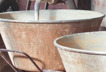
Figure 7. The bell in MMM (with blend-if) (left) and in MMM Finetuned (right)
- The MMM version seems to have lost a bit of the color variation in the foreground bells, a consequence of the blend-if action. See figure 7.
The cause of this is certainly interesting. After an application of MMM, strong magentas abound in the dark brownish plate, but some were also introduced in the lighter foreground objects. We reject one but appreciate the other. The blend-if that we used to reduce high magentas works on the upper layer, i.e. on the processed image. It removes all strong magentas, in areas where we want it but also in areas where we don't.
The MMM Finetuned however bases its masking on the original image. Before any color shift is applied, the action determines that the foreground bells must be included and the dark brown plate excluded. As long as we don't invoke blend-if here (which is rarely necessary), color variation is achieved where it needs to be and prevented elsewhere.
Figure 8. The plate in MMM (with blend-if) (left) and in MMM Finetuned (right)
- With the blend-if settings that we used, the MMM version keeps some hint of the purple in the background plate. See figure 8. The MMM Finetuned has it almost completely masked out. This is the reverse side of the (advantageous) previous point. We cannot call blend-if to strengthen the purple of the MMM Finetuned version. We could however apply MMM Finetuned again, this time on dark browns. It must be a low amount though, to prevent the "confusing image" that Margulis warns for.
Figure 9. Cyans in MMM (left) and in MMM Finetuned (right)
- The MMM version has stronger cyans here and there in the image. See figure 9. Similarly to what we did with the purples, we could reduce these using another blend-if slider.
None of these differences are very important in this particular image. Still, subtle differences can be relevant in the overall appearance of any photo. It is definitely worth verifying what MMM and MMM Finetuned do, even on smaller details.
Luminosity
Although MMM is usually associated with color variation, it may change contrast as well. The basic idea is the same: increase variation in the luminosity values of important image areas. MMM affects the whole image, MMM Finetuned limits changes to luminosity values similar to those found in the advisory selection. Again, this may lead to different results, sometimes benificial, sometimes less so.
To show the differences between the Luminosity layers of MMM and MMM Finetuned, I repeated figures 3 and 4 but with the Color layer switched off. See figures 10 and 11.

Figure 10. MMM, Luminosity only

Figure 11. MMM Finetuned, Luminosity only
The two images differ slightly.
First, the MMM version is darker overall. This is caused by the fact that we started with a light selection area. Moving everything away from light causes most of the image to become darker. MMM Finetuned masks out anything deviating too much from the initial selection, i.e. anything darker than some threshold. In other words, a better protection of shadow areas.
This protection mechanism however has a surprising side-effect. Have a look at the greyish background wall on the top right of the image. It has a definite spotty look: moisture, dirt or whatever. The MMM version retains this appearance - in the MMM Finetuned version however, it has faded considerably.
This difference has everything to do with the way MMM Finetuned works. Remember that the action limits image changes to color and luminosity values of the initial selection. In our case, light tones. Here again we can take a center value, the average L value of the selection, being 79. So, light tones are "spread apart". Anything higher than 79 (but not too high) will lighten. Anything lower than 79 (but not too low) will be darkened. Anything much lower than 79 is definitely masked out.
This explains what happens on the background wall. Lighter parts of it are included in the Luminosity update, so they get darker. Darker parts are excluded by the mask, so they keep their luminosity level. Hence the flattening effect as noted.
Remember that a considerable blur is applied on the masks, so the fine texture of the wall is not lost. But for this particular situation, one may want to change the Luminosity mask to get some of the wall's spotty appearance back.
To accomplish this, consider one of the following possibilities:
- Disable the whole layer. This will rarely be preferable, as it removes the "better contrast" effect of the action. Yet, it may work if only color variation is desired.
- Disable the mask. Care should be taken that no image areas get blown out. In the case of our image, this does not happen, but it darkens the whole image which I believe is not desirable.
- Keep the mask but blur it even further, e.g. with 100 pixels. Local differences will be blurred out, thus bringing back some of the original contrast. In our example image, this appears to work reasonably well.
See figure 12 for the results of these three options. I can't give a general advice which option to choose. Just see what works best for your image.
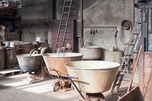
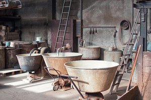
Figure 12. MMM Finetuned version with updated Luminosity mask, according to options 1, 2 and 3.
Final words
I am getting many compliments about my MMM Finetuned action. People like what it does, but like every PPW action, it should be invoked with care. If time permits, the default result should be judged critically. The action creates two layers, each with its own mask and opacity. An image may look better if one of the layers is switched off, opacities are changed, a different mask is used or some blend-if is applied.
Or - let's not forget that possibility - if it is run more than once with different selections.
Gerald Bakker, 21 Dec. 2015
Related articles
Picture Postcard Workflow